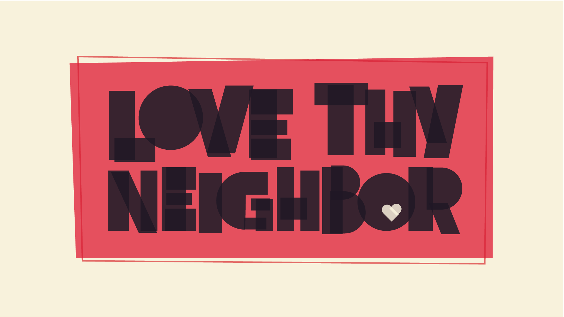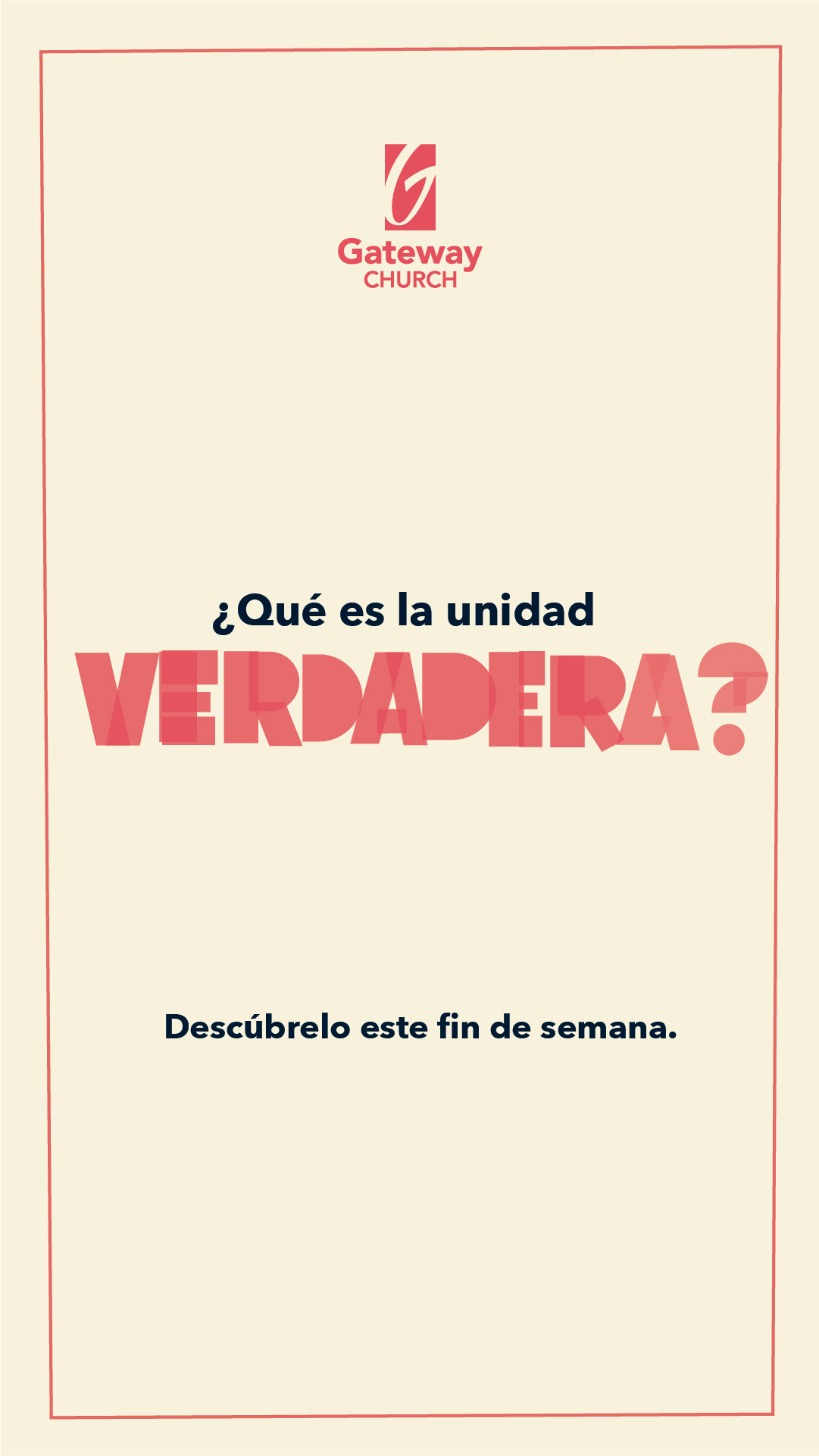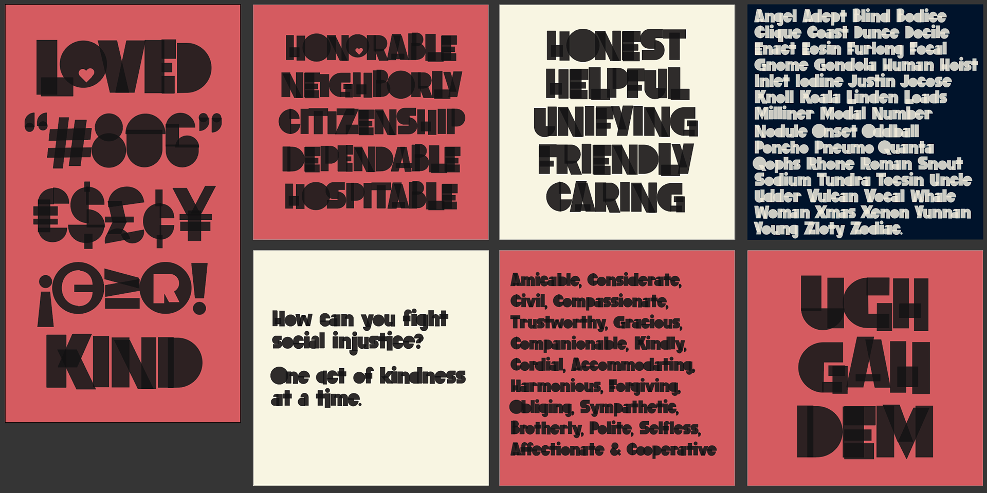
Challenged with creating a campaign that breaks down walls of prejudice and evokes unity among our society. This lettering was created for a four-week series on unity, compassion, prejudice and division. The concept represents people of different shapes and sizes coming together in unity for a common goal. The letter forms have transparencies to show the overlapping of people. The tight letter spacing reinforces the same.
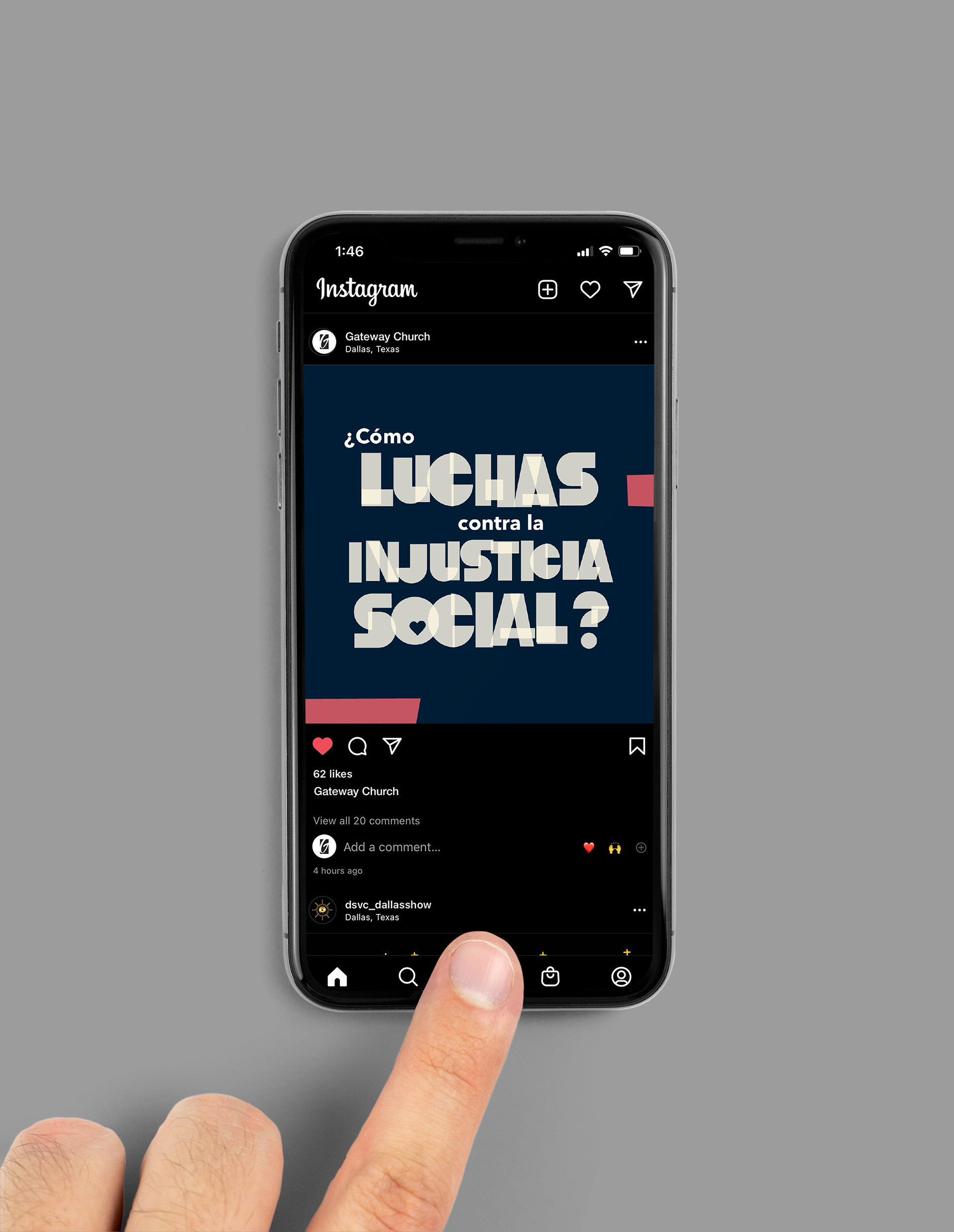
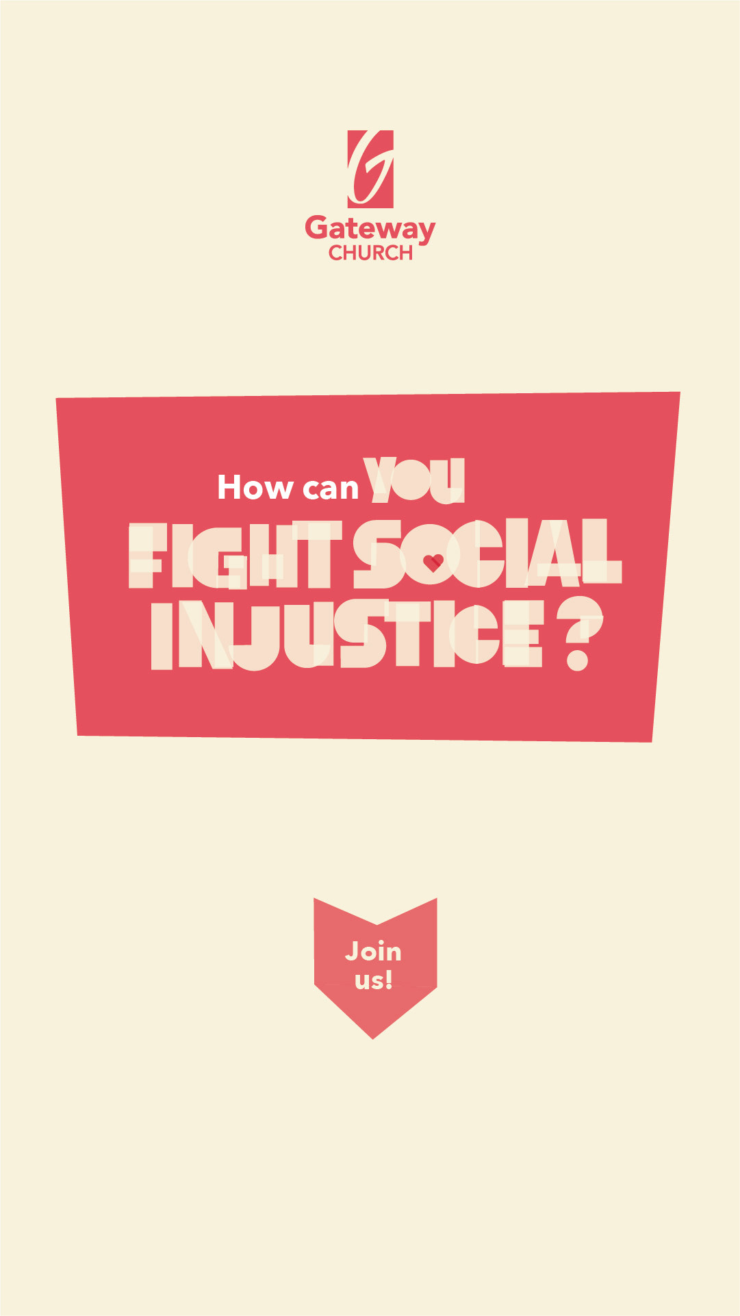
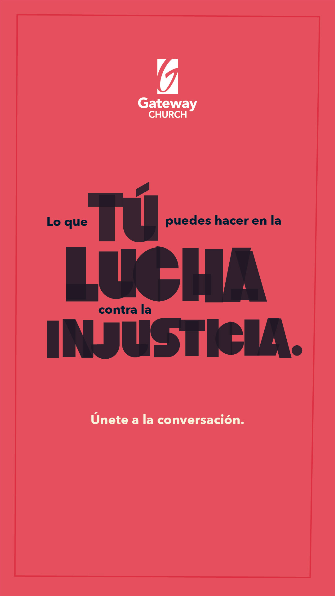
Deliverables include: Yard Signs, Stickers, Magnets, DVD Inserts, DVD Labels, Lobby Screen Graphics, Desktop & Mobile Wallpapers and Social Posts.
Building the Font
When the series ended, the importance of continuing education, unity to the community. The next idea was to create and host a conference that solely focuses on unity.
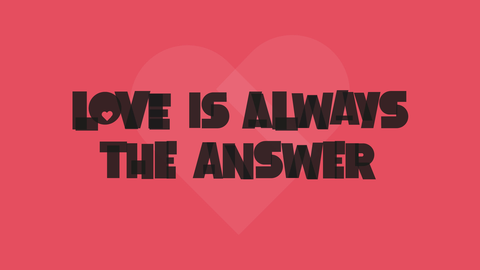
Nine months before the Unity Summit, I had the opportunity to create the full typeface that became the font Neighbor that was to be used for the identity for the Unity Summit. In order to preserve the overlapping pieces of each character, I created a color font that would allow each character to not just be a solid shape. I wanted to make the face more universal, so I created alternate and special characters that support different languages and additionally reinforces the concept.
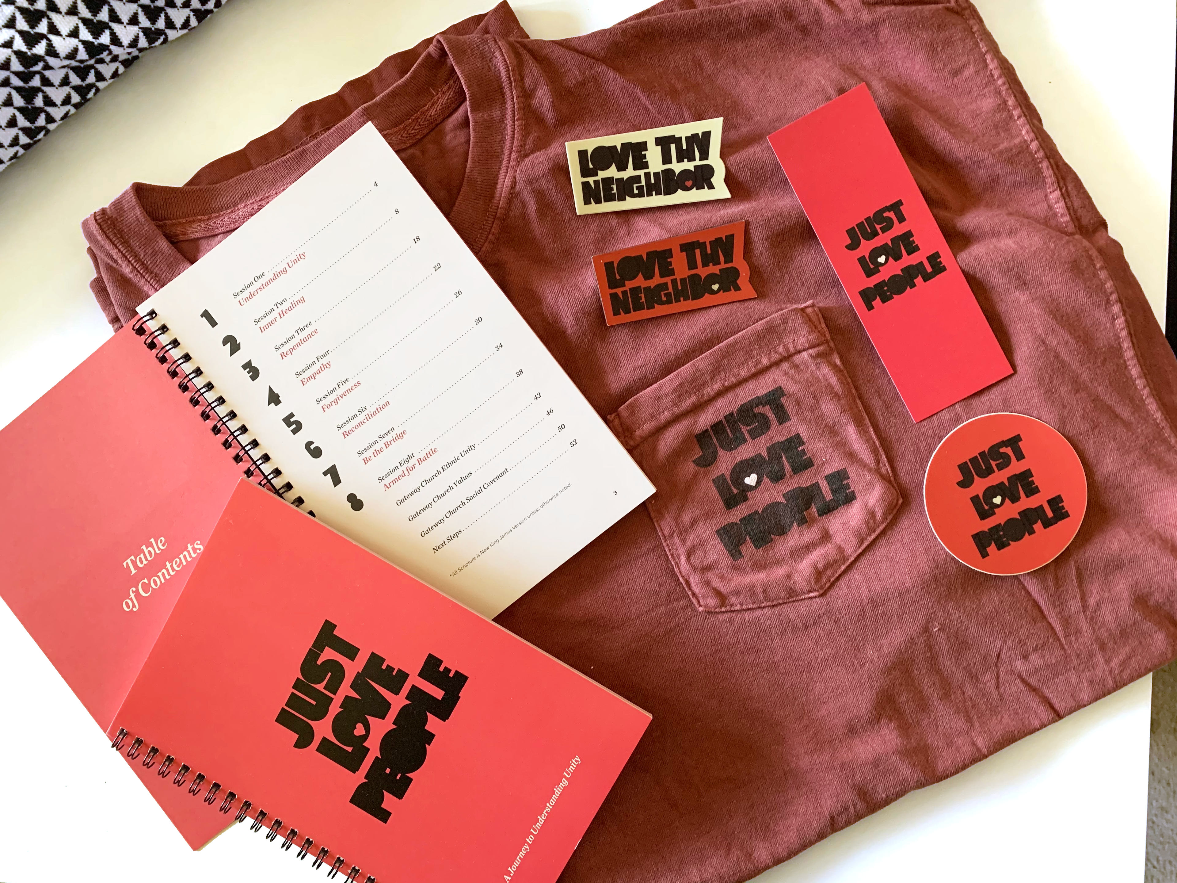
Conference Usage
The Unity Summit was in early 2021 and had eight speakers and additional panel discussions in an all-day conference solely on unity.
Deliverables include: T-Shirts, Bookmarks, Stickers, Conference Programs, Auditorium Screen Graphics and Social Posts.