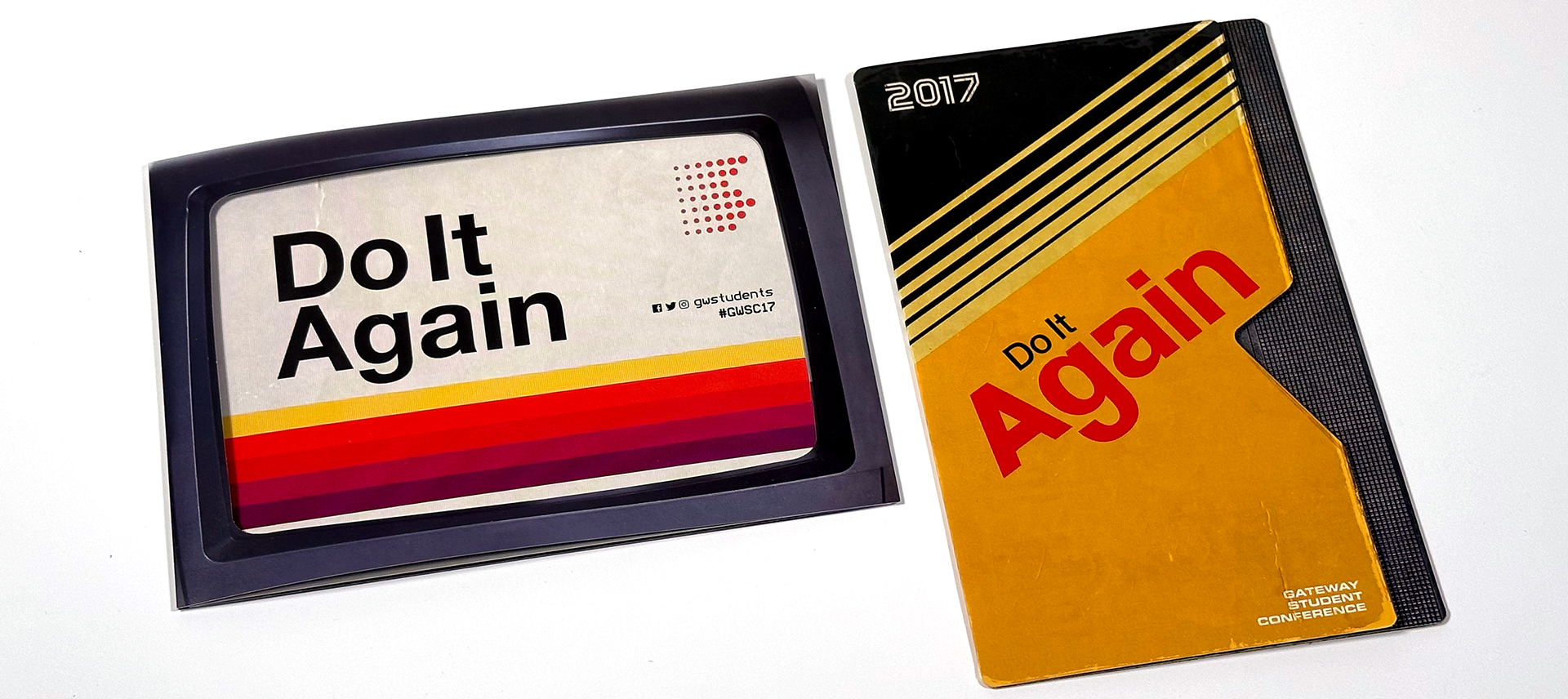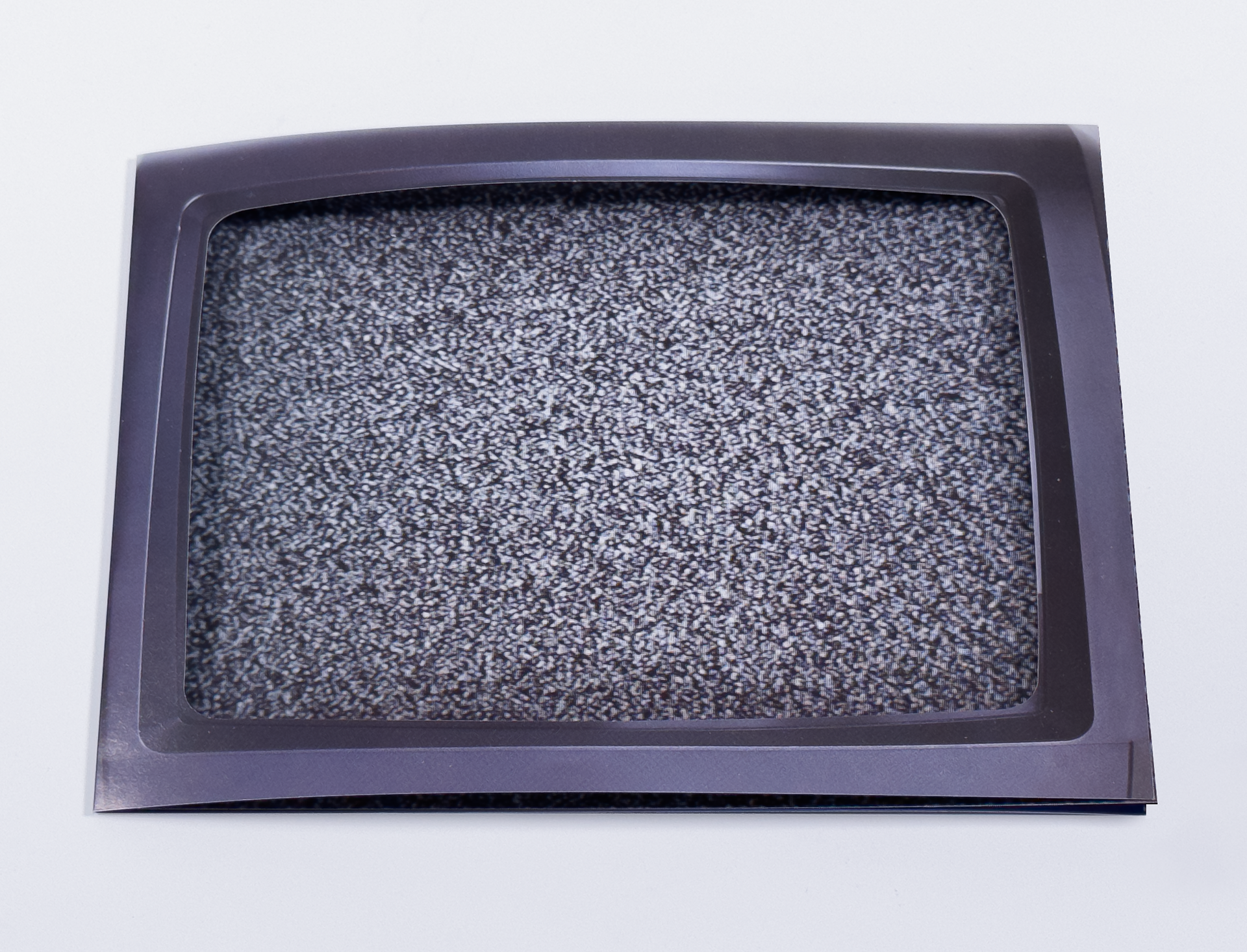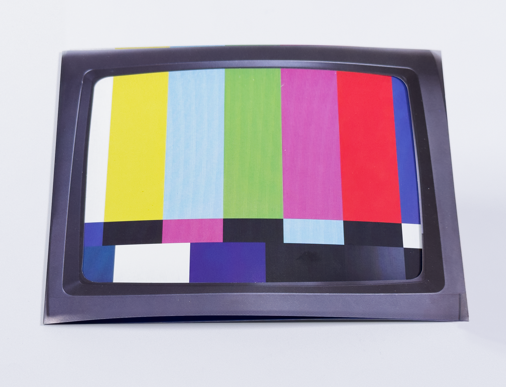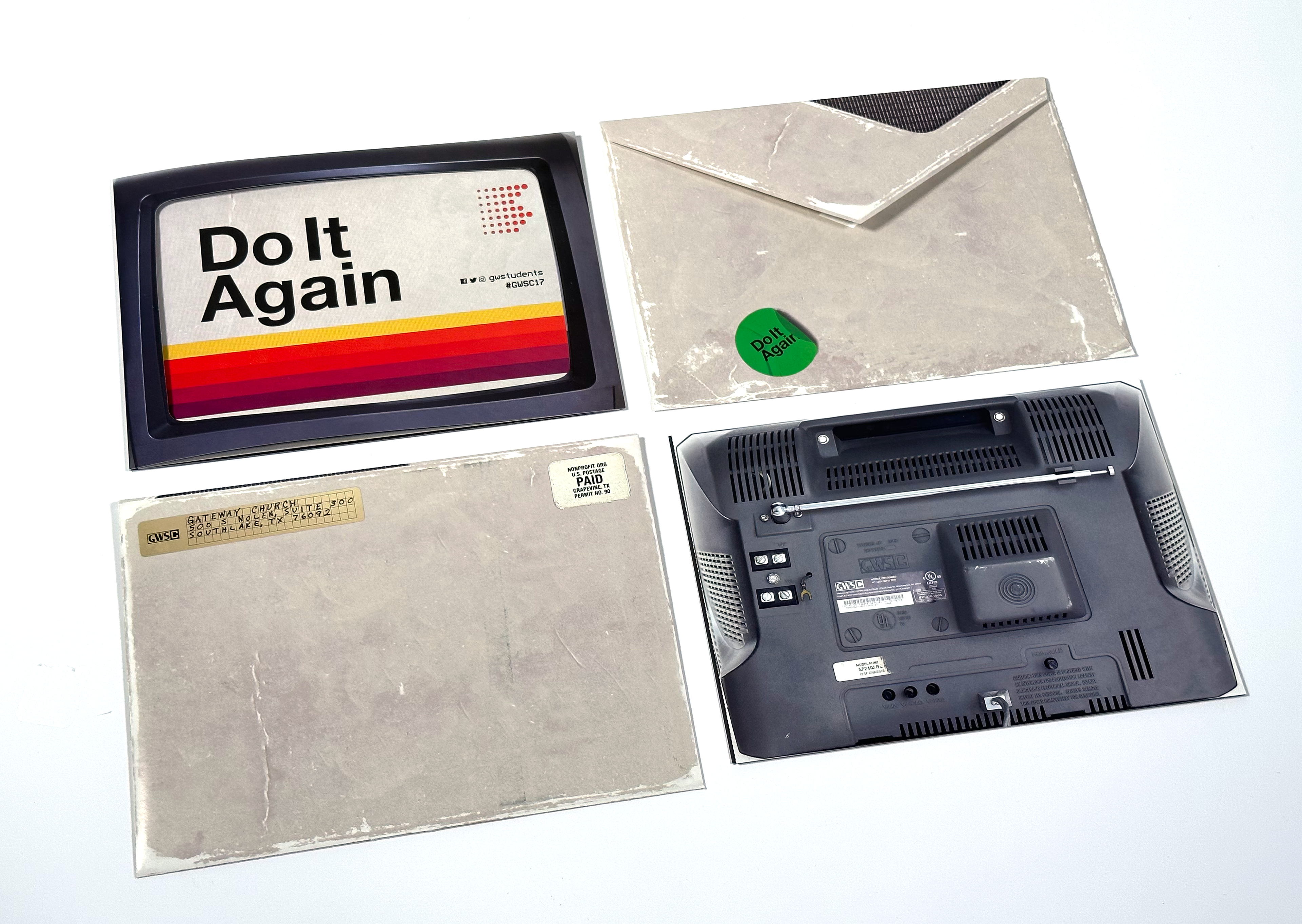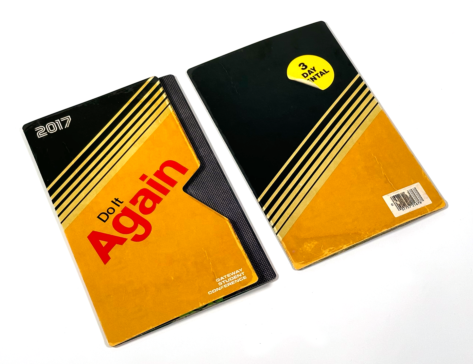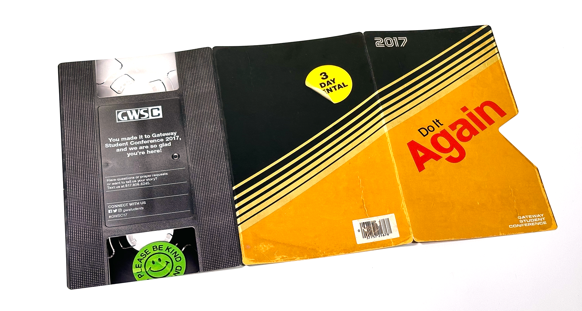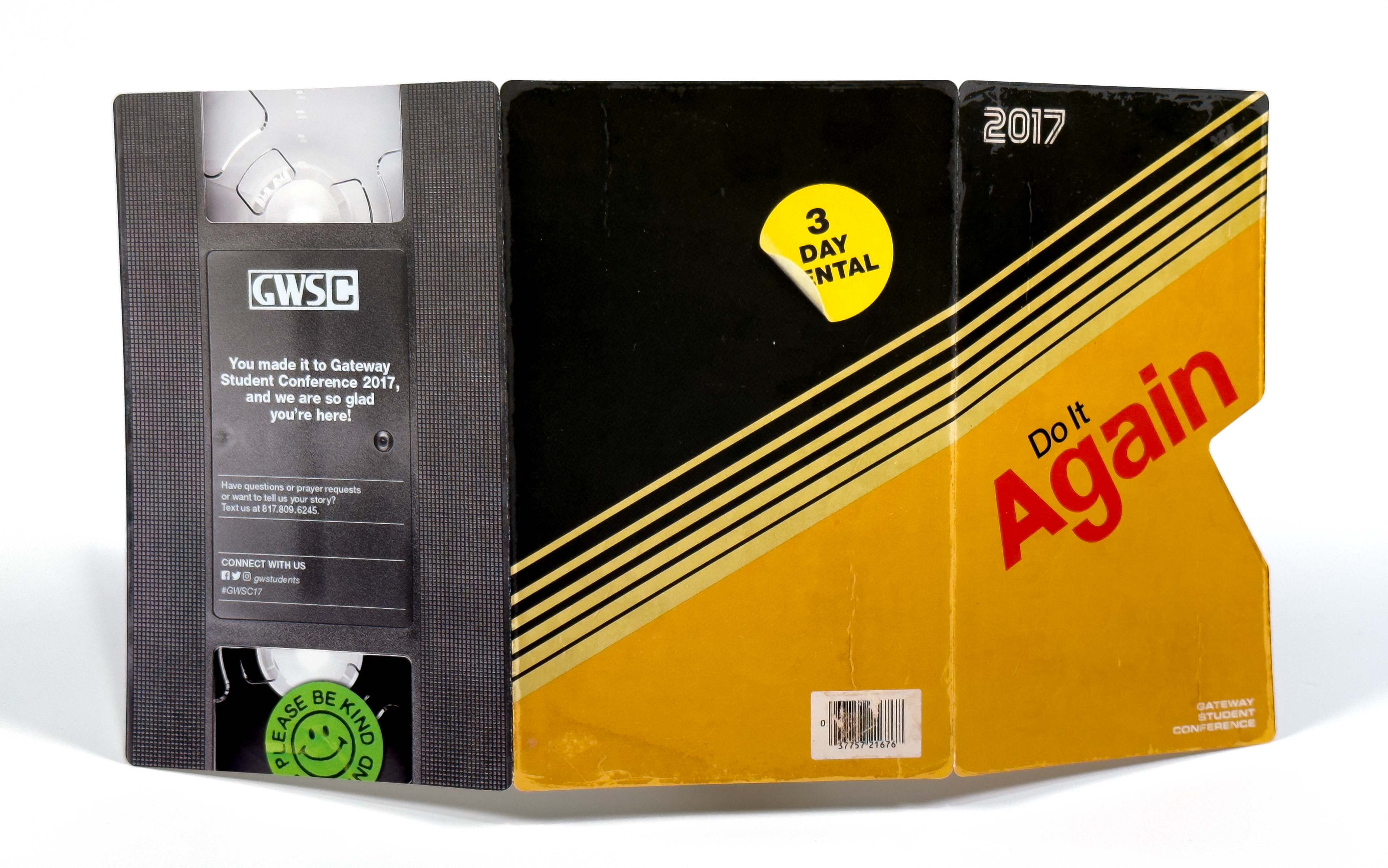
For this conference, the Identity is a nostalgic, 80s, retro-style VHS design. These are the physical design concepts I created for the mailer and program brochure, both using a different VHS cover from the ID.
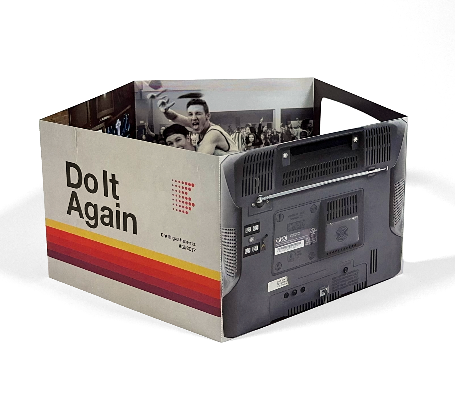
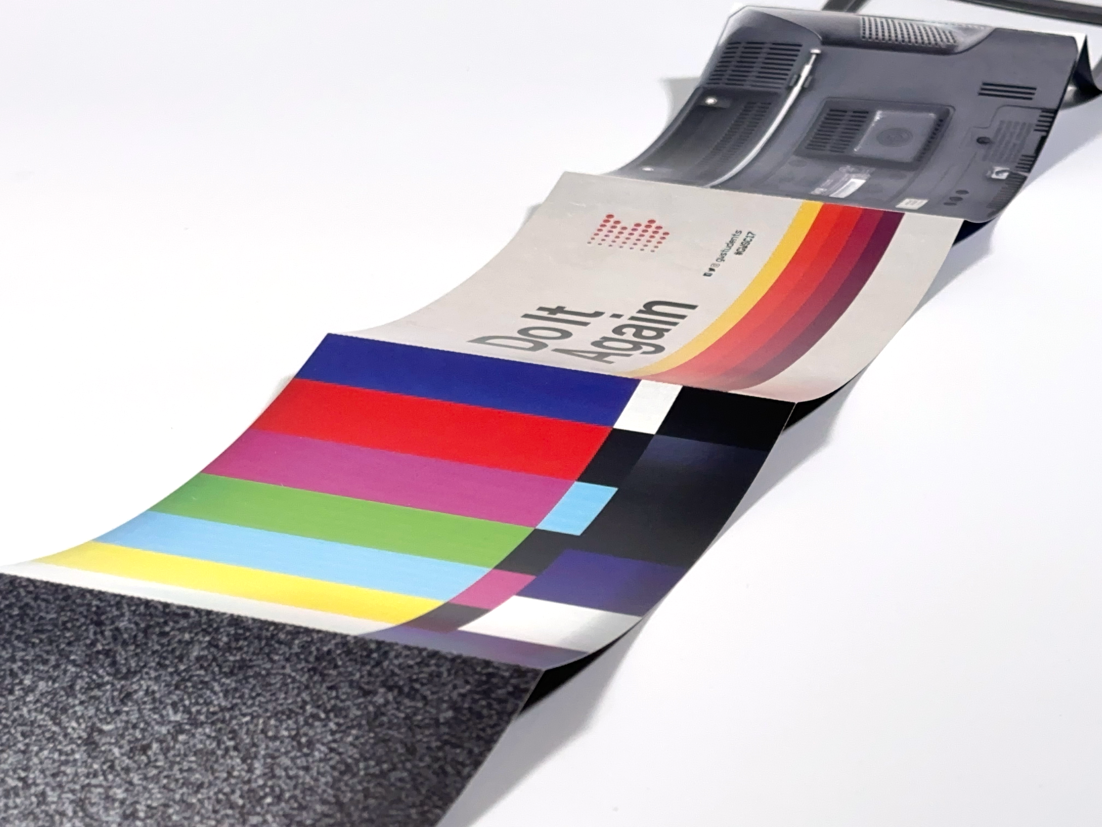
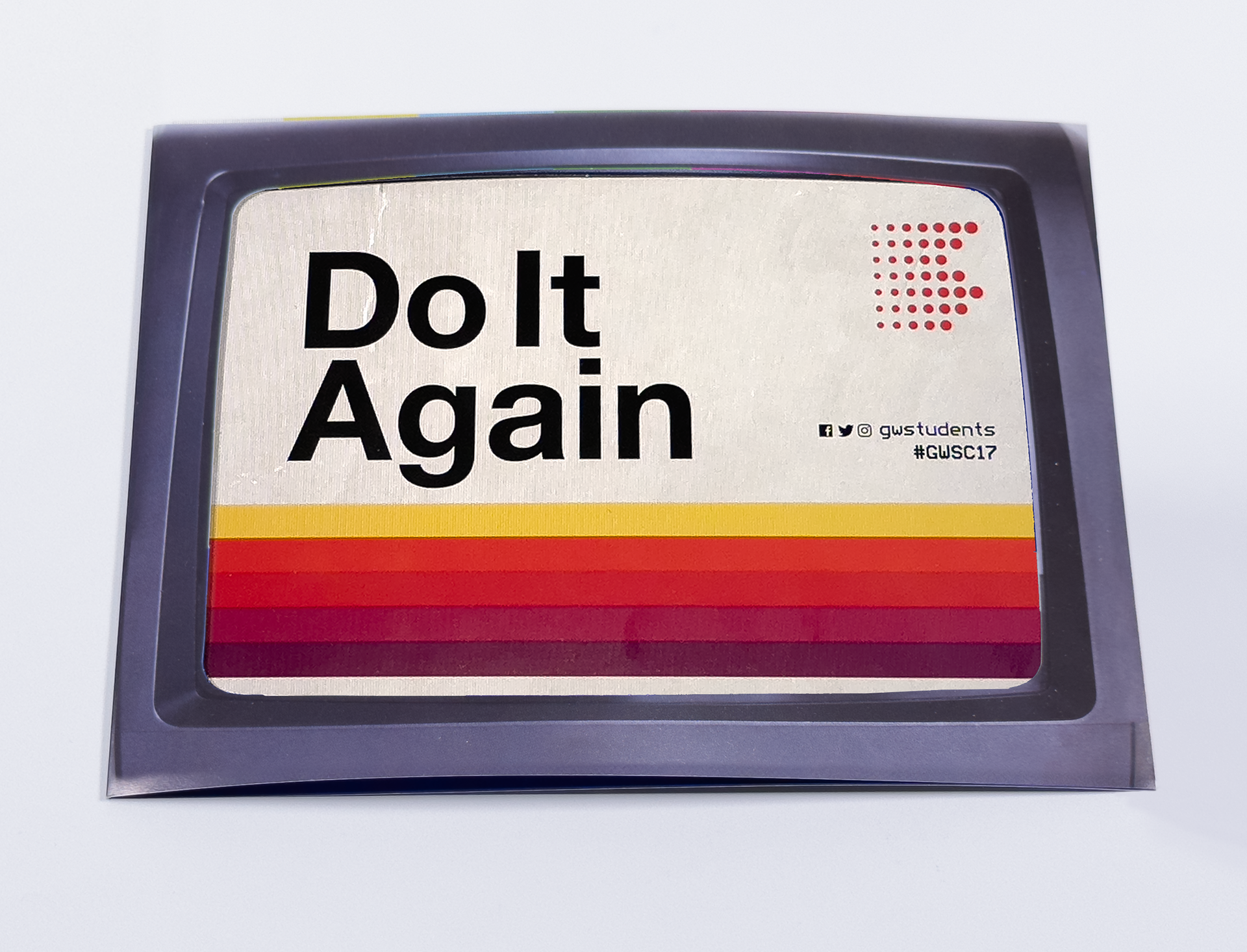
Using imagery from VCRs, rental stores, old TVs and screens from an era that played the national anthem before going off-the-air at night. The tile of the conference Do It Again was intended to have students rewind and replay events in their life that they can reflect on how God played a role in their lives and to reaffirm their love for Christ.
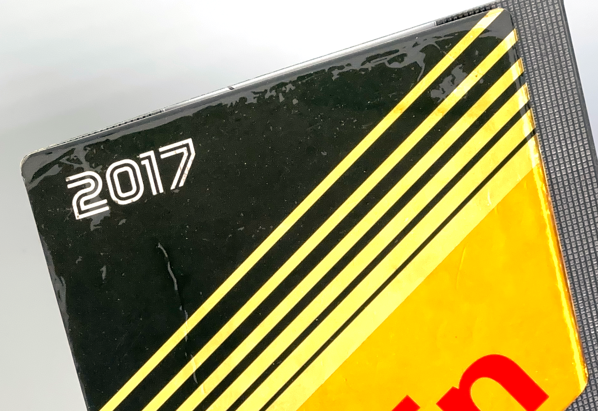
The use of die cuts and spot-dull varnish were used to mimic the visual of worn edges and textured VHS tapes.
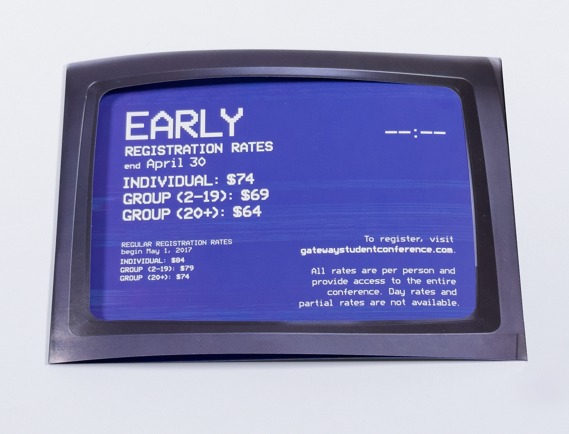
On the mailer, the screens are perforated to allow the recipient to interact with the piece by disassembling the panels and placing them inside the die-cut TV case.
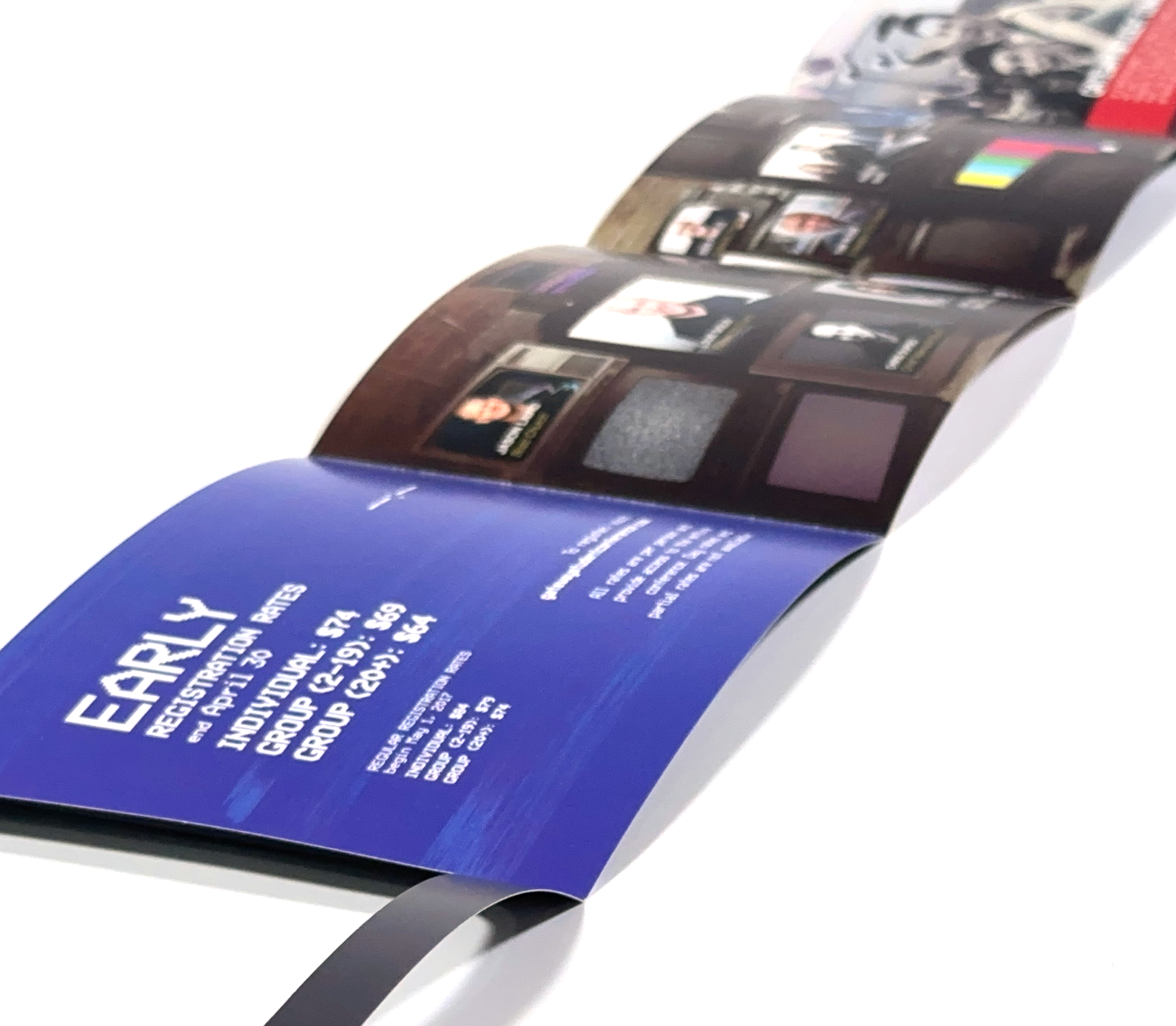
The program, the attendee would feel the dull coating as they interact with the schedule and map.
Deliverables include: Interactive Mailer, Die Cut Program, Photo Direction, Multi-Page Fold Out Design, Specialty Offset Printing